Back in the early days of VCR’s, Hitachi was a fairly common name in imported electronic consumer goods. Most RCA VCR’s were manufactured by Hitachi as well.
I came across this old ad for Hitachi Lamps (Strong! Bright!) and it unleashed a flood of memories.
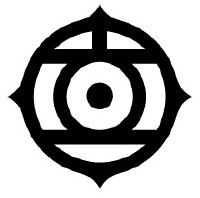
The thing that grabbed my attention when I saw this ad was the logo.
Oh, that logo. To my eyes and to my mind, it’s one of the most beautifully-crafted company logos I’ve ever seen, because it morphs the company name into a distinctive, attractive, and easily-recognizable glyph. It’s a shame they’ve given it up in favor of an English version,
although in a global market it makes a certain amount of sense.
If you have not had the privilege (or torment, depending on your outlook) of studying Japanese, let me just point out that the language is written with four separate writing systems: kanji (characters like 電 – electric, or 雨 – rain); hiragana (ひらがな – usually used for grammatical endings, particles, and pronunciation for children, among others); katakana (カタカナ – used for representing sounds and foreign words); and “romaji” (the roman alphabet, used for writing English words which are used in Japanese or in advertising, among other things.)
This makes learning the language for a foreigner doubly challenging, but to the Japanese mind it makes perfect sense. The meanings of words are so closely bound up with the visual aspect of kanji that instead of spelling a word that sounds ambiguous, a Japanese will sketch the character on his or her palm.
The name “Hitachi” in Japanese is rendered as 日立 (日, “hi”, meaning “sun,” or “day,” and 立, “tachi/tatsu”, meaning “rise” or “stand” or a bunch of other things.) Characters, however, began as pictures, and gradually evolved over time into the stylized forms we see today.
The history of the character for “sun”.
So what the brilliant designers at Hitachi did was to take the company name, and using the old form of the first character, skilfully blended the two into an eye-catching logo:
To an American, a distinctive symbol – to a Japanese, not only a picture but the company name, beautifully rendered. I miss seeing it.
The Old Wolf has spoken.


Thanks for this post – as an employee of a company that’s just been acquired by Hitachi, I’ve seen this symbol on business cards and have wondered what it meant. Thanks for the clarification! You do see the symbol being used sometimes by Hitachi companies – e.g. at http://www.hitachipowersystems.us/index.html
🙂 I’m glad you found this useful!
Pingback: A very pleasing Logo. | Playing in the World Game
Pingback: So let it be written! | Playing in the World Game
It is still used quite extensively: http://www.hitachiconsulting.com/
I am glad to see that, thank you!
Pingback: What’s in a Logo? | Playing in the World Game