Over time, a number of corporate logos and personages have undergone subtle and not-so-subtle shifts in image to reflect changing social attitudes. Retroactive continuity (retcon for short) is the alteration of previously established facts in a fictional work, most often used in the comic book universe. What follows are a few brands who have re-worked their logos or spokespeople.
Aunt Jemima
This is one of the first brand updates that I recall being aware of.

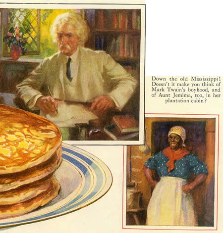
This ad was from 1909. and Auntie looks like Al Jolson.

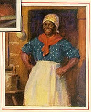
This 1925 ad shows a “mammy” looking more like an animated cartoon caricature, more clearly visible in the enlargement below.

The Aunt Jemima I remember looked cuddly and plump and just like the nanny you’d love to have:

And mm-mm! Don’t she make dat good fried chicken, too. The company was obviously trying to present an image of down-home, antebellum comfort, which in the 50’s still seemed totally à propos in the American psyche. As it happened, I did have two African-American nannies when I was growing up; Edith did make killer fried chicken, and also taught us how to make our own soap with animal fat and lye which had been leached from ashes. Nice lady, and sharp as a tack.

There was another one that I recall – she looked a lot like the plump Jemima, but wasn’t anything like the image. I don’t recall her name, but she chased me around the house with an ashtray, and that was the last time I ever saw her.

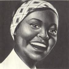
In 1968, Auntie got a makeover – she shed a bunch of weight and they lightened her up considerable. By the 60’s, the civil-rights movement was in full-swing, and the black mammy image wasn’t going to go over well with a large part of America’s population. Still, there were conflicting attitudes within the black population as well: hair straightening and skin lightening were popular, as though it somehow made a difference in social acceptance or self image.

Finally, in 1989 Aunt Jemima shed her scarf to reveal a natural hairdo and earrings.
A brand is a powerful thing. People have been buying Aunt Jemima products for almost 120 years, and a company would be loth to give up that kind of brand exposure. It seems to me, though, that clinging to the name and logo, even though updated, falls into the same zone as naming sports teams things like the Braves and the Redskins; it might be time for a complete rebranding, much the way Esso became Exxon, or U.S. Steel became USX. (Not that the letter X has any special value – I don’t know how likely I’d be to buy Nxxoxxi Pancakes. I make my own from scratch, anyway.)
The Campbell Kids

This one is unusual. The original kids were designed by Grace Drayton in 1904, and they were strong with the force through the 20’s, when their popularity tapered off. In the 50’s the kids were revitalized, had their own TV show, and have been part of the Brand ever since. The first image is from 1930, the second from the 50’s, and the kids are just as plump and well-fed as a Reubens painting. In 1984, the kids got a baryatric re-work, as seen in the third image above – but it’s not easy to find any pictures of the re-designed twins out there – it’s almost as if they have been scrubbed from the net.
Quaker Oats
Larry, the smiling Quaker so familiar to oatmeal lovers, was given a makeover in 2012 in order to keep the 135-year-old Quaker brand “fresh and innovative,” according to the company. The changes were subtle – a bit less hair, about 5 lbs off the face, and a few wrinkles gone – but he does look a tad younger and healthier than he used to.
 ‘
‘
All of these changes make a certain type of sense. Racial attitudes change, and people are becoming far more health-conscious. But the next one seems to come from somewhere out beyond Pluto (which is still a planet), if you get my drift.
Minnie Mouse
Apparently, Barney’s department store is not satisfied to use Minnie Mouse as she normally looks in a Lanvin dress… so they’ve resurrected Heroin Chic for the occasion.

What? The? Hqiz?
This insult to the whole concept of body image (apparently only 5’11”, size zero looks good in Lanvin) has prompted a petition over at change.org entitled “Leave Minnie Mouse Alone,” which at the time of this writing almost 90,000 people have signed. From the petition website:
According to sources cited on the non-profit National Association of Anorexia and Associated Eating Disorders website:
- 47% of girls in 5th-12th grade reported wanting to lose weight because of magazine pictures.
- 69% of girls in 5th-12th grade reported that magazine pictures influenced their idea of a perfect body shape.
- 42% of 1st-3rd grade girls want to be thinner.
- 81% of 10 year olds are afraid of being fat.
Girls have enough pressure to be thin, now the beloved Disney mouse of their childhood has to add to the message that the only good body is a tall, size 0 body? Enough already. Let’s give girls a chance to celebrate the actual bodies they have instead hating them for not fitting into a Lanvin dress. Then maybe enough girls will get together and demand dresses that look good on their actual, non-digitally altered bodies and designers will just have to become talented enough to design a dress that looks good on them.
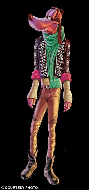
For what it’s worth, Minnie is not the only character to be violated in this manner:

Daisy Duck as a starving Barbie

Goofy looking like nothing more than an “Axe” model.
Really, Barney’s. How in thunder did something like this ever pass muster? And who at Disney greenlighted this use of their characters? I can only think that the executives themselves were smoking something.
The Old Wolf has *gag* spoken.


