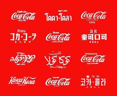
Companies spend large money developing a logo that speaks to the world. They are an integral part of brand recognition – who in the world doesn’t recognize the Coca Cola logo, even if they don’t speak English or use Roman script?
Who in the world doesn’t see the “golden arches” and immediately know that McDonald’s is close by?
These logos and these brands are worth millions if not billions of dollars, and they are ferociously protected and actively marketed around the world.
Some logos, however, are more than eye-catching; they’re supremely clever, some from equally powerful companies and some from local enterprises.

Amazon, of course, ships everything from A to Z and a lot of stuff in between. The arrow, in addition, looks very much like a smile, suggesting how pleased you’ll be with your order. Just don’t talk to the people who work there – they’re not terribly happy with their job conditions.
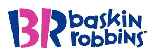
Baskin-Robbins prides itself on its 31 flavors (seen above in the logo) but not on their value as health food. Duh. John Robbins, son of founder and owner, left the empire for more wholesome pastures, and encouraged his father to step away from the inevitable when he got him to live a healthier lifestyle after the father had been diagnosed with diabetes, high blood pressure and heart disease. Years before, partner Burt Baskin had died from a heart attack.
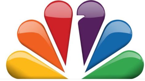
Anyone who grew up with black-and-white televisions and saw color for the first time probably saw the NBC “proud as a peacock” logo:
Today’s stylized logo retains the peacock, even if you have to look for a bit to find it:
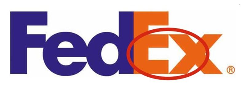
One of the cleverest logo inclusions is the one FedEx (or their designer) came up with. They want you to know that your package is on the way, and so that little subliminal arrow helps you understand that they move stuff, and quickly.
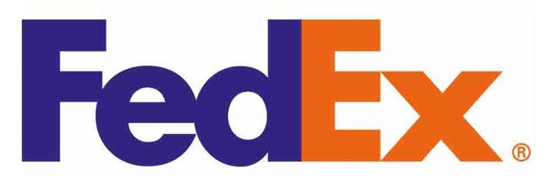
Never seen that arrow? Here it is:
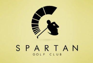
Spartan golf clubs are represented by a man with a powerful swing – but if you look at the entire picture in a different light, you see a Spartan warrior in profile with his iconic helmet.
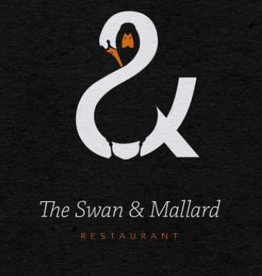
This is one of the most delightful recent designs I’ve seen, with a very creative use of positive and negative space – the swan, the mallard, and the ampersand (&) all combined into a very pleasing and evocative image. Artwork was created by John Randall.
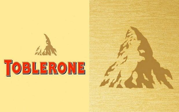
Ever look closely at the Toblerone logo? Seen the bear in that mountain? Berne, Switzerland, is notable for its bears, icon of the city.
But wait, there’s more!
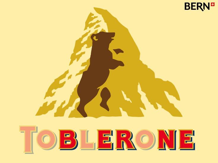
Yes, the home city of Toblerone is also found in the name.
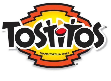
Then there’s the Tostitos logo. Look closely and you’ll see two folks sitting at a table with salsa, sharing a tortilla chip.
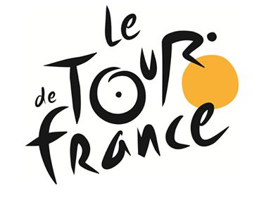
Le Tour de France logo clearly represents a person on a bicycle, with one wheel yellow, probably evoking the yellow jersey that the winner gets to wear. Unless he’s outed for massive doping, but that’s another story.
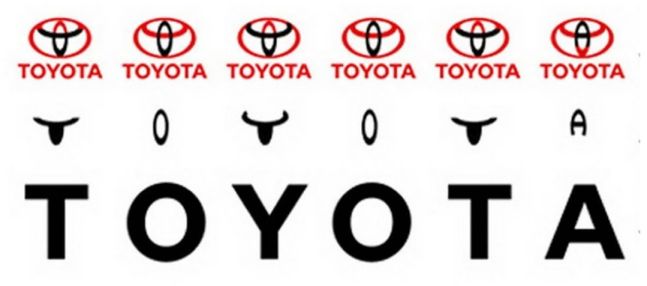
The official Toyota explanation of their logo is as follows:
In 1990, Toyota debuted the three overlapping Ellipses logo on American vehicles. The Toyota Ellipses symbolize the unification of the hearts of our customers and the heart of Toyota products. The background space represents Toyota’s technological advancement and the boundless opportunities ahead.
But whether or not they intended it, the image has an additional fillip of intrigue:
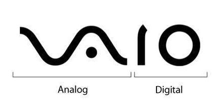
One of my earliest PC-type computers was a Vaio – and their logo is a brilliant blending of the analog computers of the past (represented by the sine wave seen on an oscilloscope ( and the digital computers of today, represented by the “1” and “0” of binary bits.
Yoga Australia managed to work the shape of their homeland into the image of a young lady in a yoga pose – Oi oi oi, mates!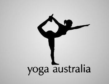
Lastly – and there are many others that I haven’t touched on in this post, but these were some of my favorites – is the logo for Hitachi, which I have written about in detail.
Hitachi was once one of the most well-known brands in electronics; for more about this fascinating logo, click through.
Naturally, there is the other end of the scale – logos which are awful for any number of reasons.
This one just hurts to look at because of the clashing colors.
Many of the ones which have been called out can’t be shared here, as I try to keep this blog on a family-friendly plane – but if you’re interested, just do an image search on “the world’s worst logos” and you’ll see what I mean.
Logos, like domain names, can contribute to the success or failure of an enterprise, which is why companies are willing to spend significant amounts having their logos designed. If the stars align, a logo can be a tremendous and memorable success.
The Old Wolf has spoken.
