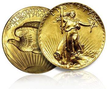
I previously wrote about what I considered to be America’s most beautiful coinage:
Today, paper money gets a turn.
From Wikipedia:
The Educational Series series of notes is the informal nickname given by numismatists to a series of United States silver certificates produced by the United States Treasury in 1896, after Bureau of Engraving and Printing chief Claude M. Johnson ordered a new currency design. The notes depict various allegorical motifs and are considered by some numismatists to be the most beautiful monetary designs ever produced by the United States.
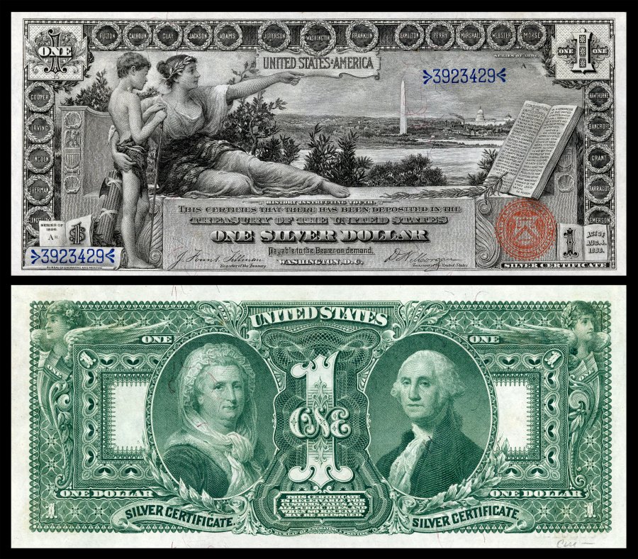
The One Dollar Bill
The Goddess History instructing a youth, pointing to a panoramic view of the Potomac River and Washington D.C. The Washington Monument and the US Capitol Building are visible in the background. The United States Constitution is displayed to the right. Circling the motif are the last names of famous Americans. Some of those listed are: (George) Washington, (Benjamin) Franklin, (Thomas) Jefferson, (Robert) Fulton, (Samuel F.B.) Morse, & (Ulysses S.) Grant. Full Resolution.
Reverse: Martha and George Washington.
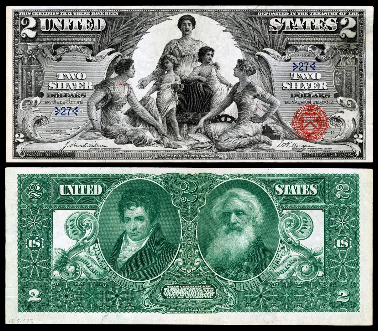
The Two Dollar Bill
Science (center) presents Steam and Electricity (the two children) to the more mature figures of Commerce (left) and Manufacture (right). Full Resolution
Reverse: Robert Fulton and Samuel F.B. Morse
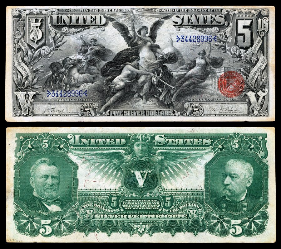
The Five Dollar Bill
Electricity surrounded by other allegorical figures, representing the dominant force in the world. The United States Capitol building can be seen behind the female figures. Full Resolution
Reverse: Ulysses S. Grant and Phillip Sheridan
These beautiful works of art, embodying both aesthetically and factually pleasing images combine with superb engraving skill1 to create works of incredible beauty.
Not surprisingly, some Boston society ladies got their knickers in a twist over the bare breasts visible on the $5.00 note, and some bankers refused to accept these bills. The Bureau of Engraving planned a “draped” version for the 1897 series, much as the 1916 Standing Liberty quarter was re-designed the following year for the same reason (see the above-linked article), but the design was never used.
For the longest time, American currency has been soul-searingly boring. We used to be able to get away with it because the world valued the dollar no matter how ugly it looked, but those times are coming to an end. I have long wished that we could redesign our currency along the lines of things done by Australia and other countries, but as long as government is dominated by people who are convinced that the almighty dollar is unassailable, this is unlikely to happen.
At least at one point in our history, people were willing to try something new and different.
The Old Wolf has spoken.
1 On a semi-related note, a wonderful and chilling tale which involves engraving skill can be found in “Don’t Look Behind You” by Frederick Brown. I recommend it, but not if you’re home alone on a dark night.


